
tiket.com / Help Center
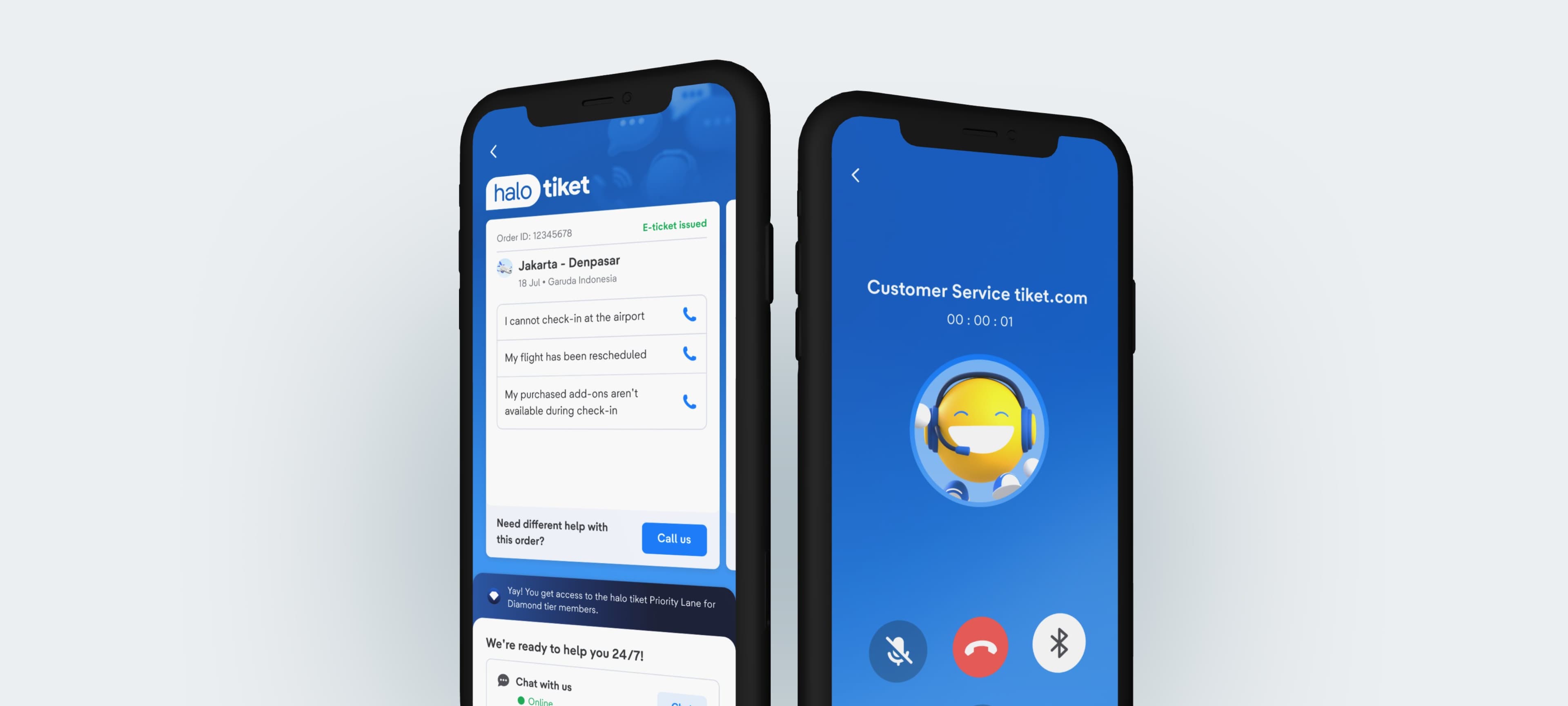
Redesigning Help Center into halo tiket Customer Support
Disciplines applied across this project:
- User Research
- Product Design
- Product Strategy
- Project
- Help Center Revamp
- Duration
- Q3 2025 (3 months)
In A Nutshell
Reducing Case-to-Book Ratio Through Self-Service
This project highlights the Re-design tiket.com's Help Center experience to reduce contact-to-agent (CTB) by guiding users toward faster, self-service solutions, while keeping human support accessible when truly needed. In this project, I had the experience of conducting the following:
- In-App Support Research with 10 users across 3 Help Center familiarity levels
- CS Agent Research: interviews and observation across L1 and L2 agent teams
- Leading workshop with new stakeholders: CS (Customer Service), CX (Customer Experience), Brand Marketing, Corporate Strategy
Here's how the story goes ▼
Context
What is tiket.com?
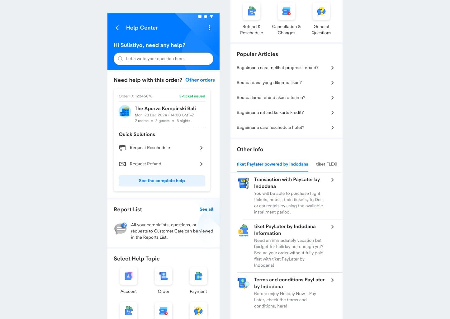
tiket.com is a Southeast Asian travel unicorn serving 52+ million active users across 10+ travel products, including flights, hotels and trains. This was the Help Center we started with.
Problem & Objective
Why the Help Center wasn’t working
2x
Users chose an agent over self-service
31.1% clicked Contact Us; 16.8% opened an article
A significant portion of cases are repetitive and low-complexity, such as:
- "Where is my refund / what's the progress?"
- "Has my ticket been issued?"
- "What's my booking status?"
Three structural problems explained why:
Article-heavy layout: long lists of static, text-heavy content
Discouraged exploration and pushed users straight to an CS agent
Cluttered information architecture: too many categories and low-value links
Overwhelmed users on arrival and eroded trust in the page
No personalisation: content ignored user intent and recent activity
Users skipped self-service entirely and went to a human
User Research
How Users Actually Seek Help
We conducted 10 in-depth interviews and usability tests with users who had contacted CS about a flight or hotel in the previous three months, sampled across three levels of Help Center familiarity: never heard of it, aware but never used it, and tried it then stopped.
Key Insight #1
WhatsApp becomes the highest support channel
WhatsApp becomes the highest support challenge compared to other channels because users are able to access to CS agents directly.
Support Channel Usage
- WhatsApp37%
- Phone20%
- Live Chat15%
- Other28%
Key Insight #2
Only 46%
of surveyed users recognised the Help Center as a support channel
46%
Recognised
- Recognised (46%)
- Not recognised (54%)
Key Insight #3
Users first instinct is to call CS regardless of issue severity.
Because of this instinct, users do not prefer to be talking to bots.

Aligning Goals
User Intention vs Product Intention
I led a cross-functional workshop with CS, CX, Brand Marketing, Corporate Strategy and Tech Leads to surface what each function actually needed from the Help Center, before any design work began.
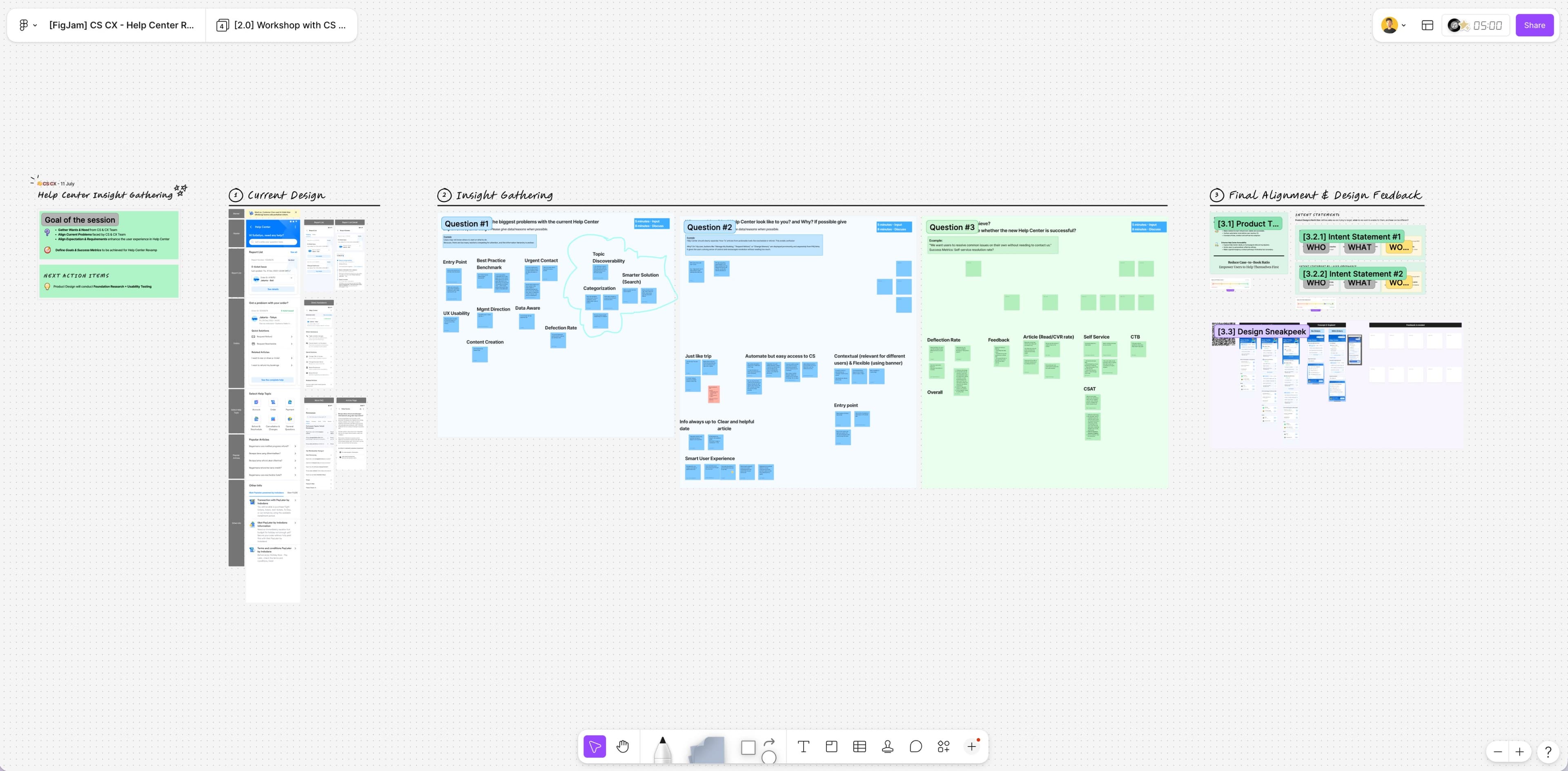
Three distinct agendas surfaced:
CS (Customer Service) & CX (Customer Experience)
- Fewer repetitive inquiries reaching agents.
- Cases that arrive pre-categorised, with the order already attached.
- Automation first, but never blocking the path to a human.
Brand Marketing & Corporate Strategy
- Rebrand the Help Center and give it clear USPs.
- Build a named service identity, benchmarked against BCA's "HaloBCA".
- Dedicated treatment for Diamond Tier members.
Product & Tech Leads
- Reduce Case-to-Book ratio and lift automation adoption.
- Route users to self-service first.
How Might We
HMW Questions
HMW avoid making users feel overwhelmed?
HMW encourage users to resolve their issues through smart self-help?
HMW show the most relevant actions based on user context (order + time)?
Design Principles
Guiding Goals
Encourage Automation
- Lower contact-to-agent for repeatable issues.
- Shift non-urgent help into chat.
- Free agents to focus on genuinely complex cases.
Contextual
Surface the phone only when urgency genuinely warrants it.
Simplicity
Recommend help based on the user's actual order, not a generic list.
Final Design
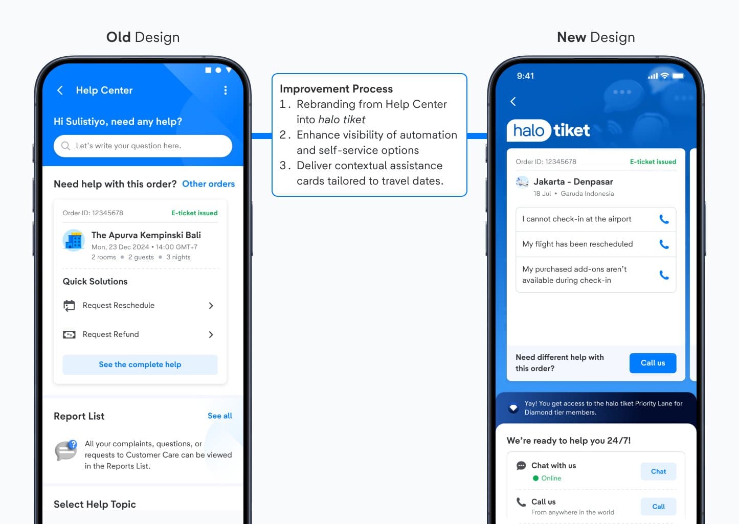
From Help Center to halo tiket
Only 46% of users recognised "Help Center" as a support channel, and the name itself signalled "article library". We rebranded it as halo tiket Customer Support and rebuilt the page around six decisions:
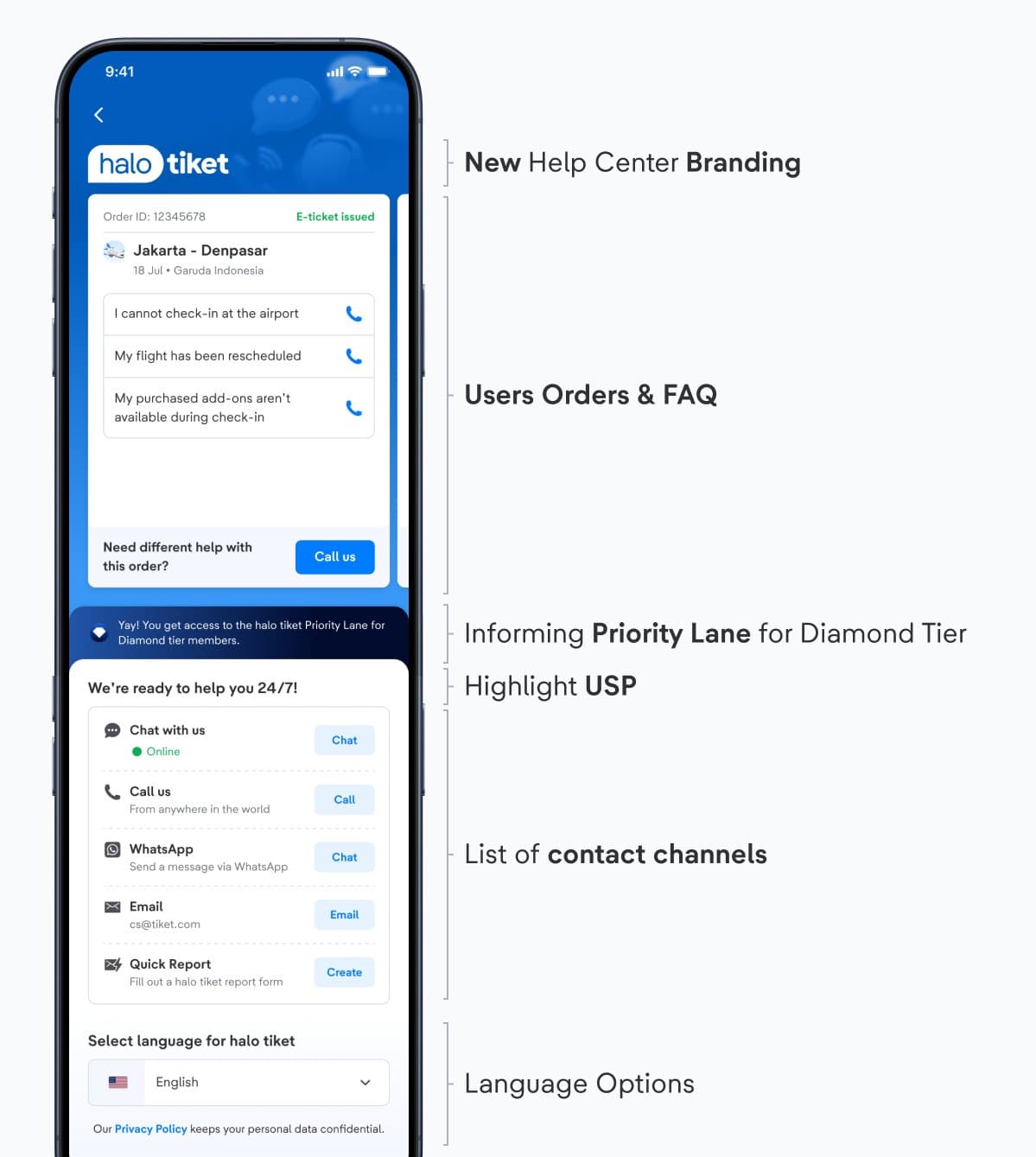
“halo tiket” branding
- A new identity developed with Brand Marketing, replacing a label most users did not recognise and align with BCA’s HaloBCA (our sister company).
Order card and FAQ
- 93% of cases come from users with an active order, so the order greets them first.
- Three prompts only, to cut decision fatigue.
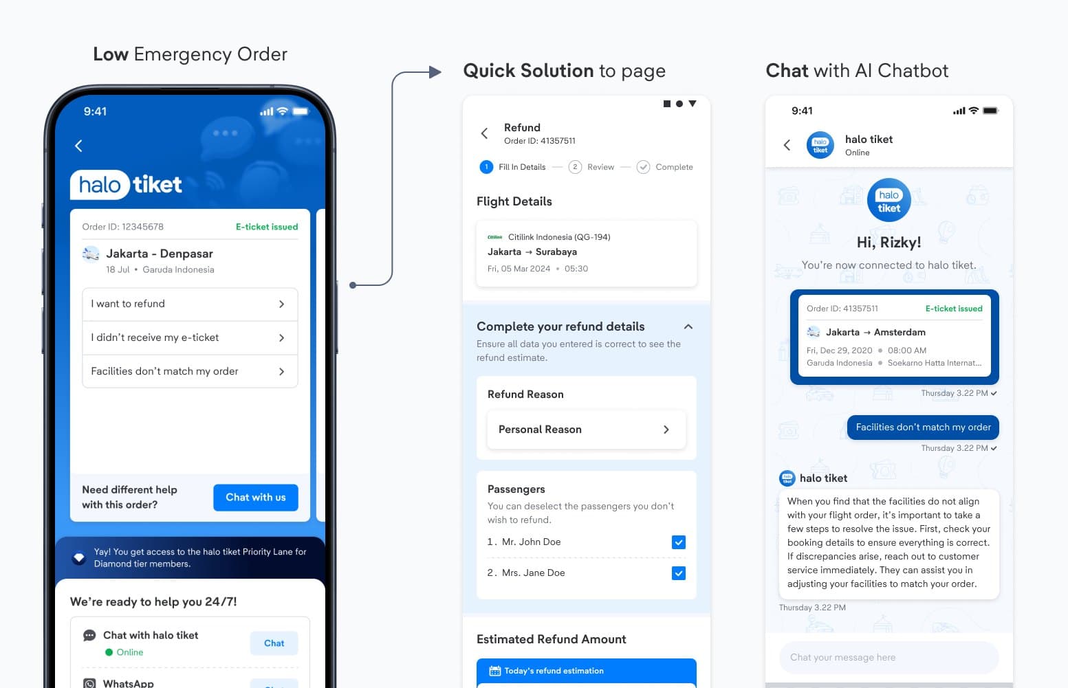
- Tapping a prompt directly defines the order ID and category of complaint/inquiry, removing friction for the user and manual work for the agent in one move.
USP #1: Priority Lane for Diamond Tier
- Placed directly above the channel list, at the moment a user decides whether contacting support is worth it.
- Tier data also drives agent routing, so the promise is backed by real handling.
USP #2: 24/7 availability
- To reassure users that we’re ready to help them anytime
Contact channels
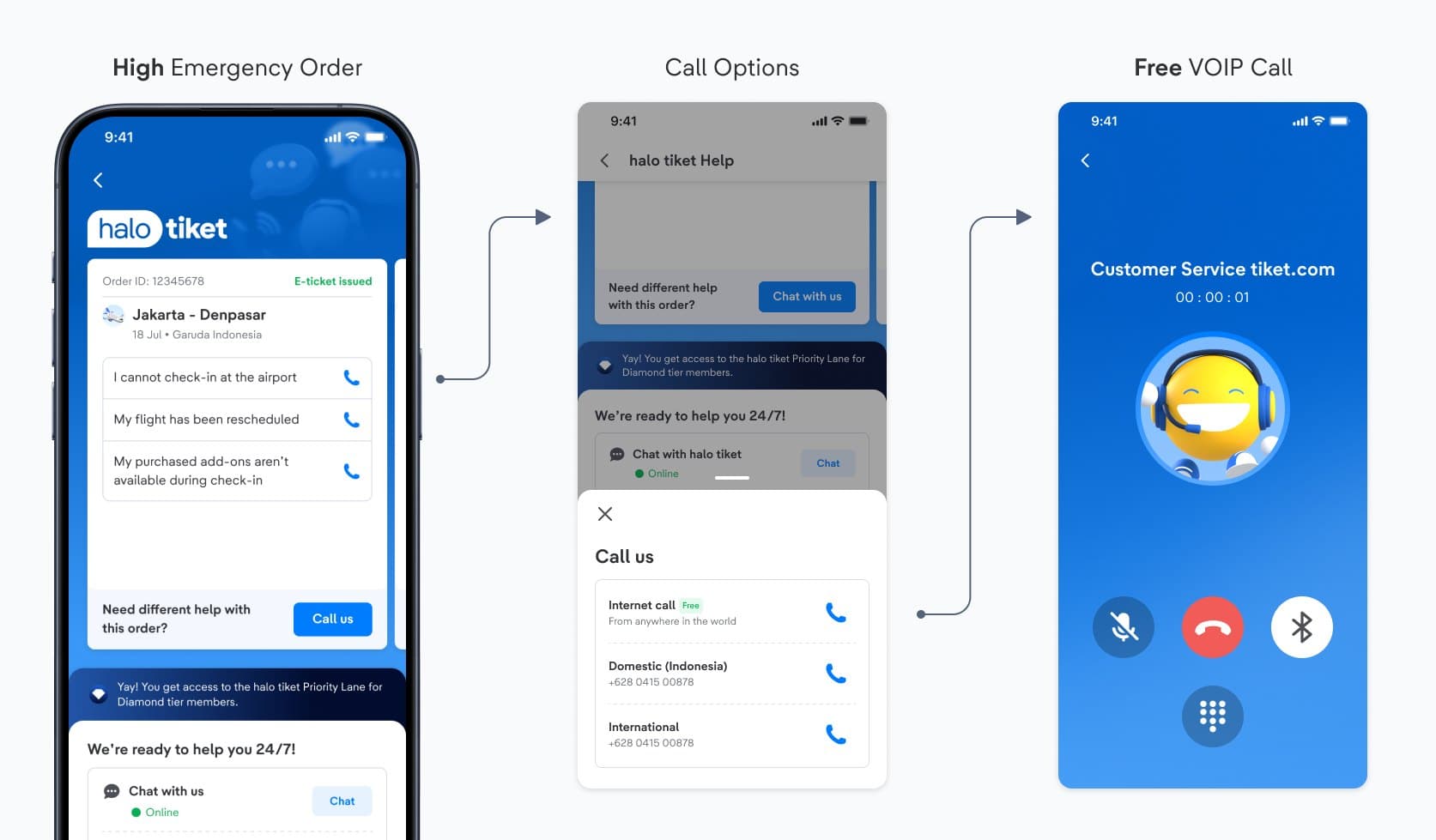
- Chat sits above Call deliberately, to intercept users scrolling for the phone number.
- "From anywhere in the world" leads with VoIP, since call cost was the main reason users avoided phoning.
- The list changes with urgency: call options appear here, not in the Low Emergency state.
Language selector
- Many Indonesian users browse the app in English but want to be answered in Bahasa Indonesia. Capturing that preference explicitly also removes the language step from the chatbot flow.
- Placed at the bottom because it is a set-once preference, not a task.
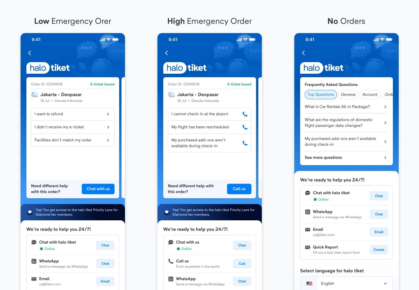
Achieving the 3 Goals
How the Design Achieves All 3 Guiding Goals
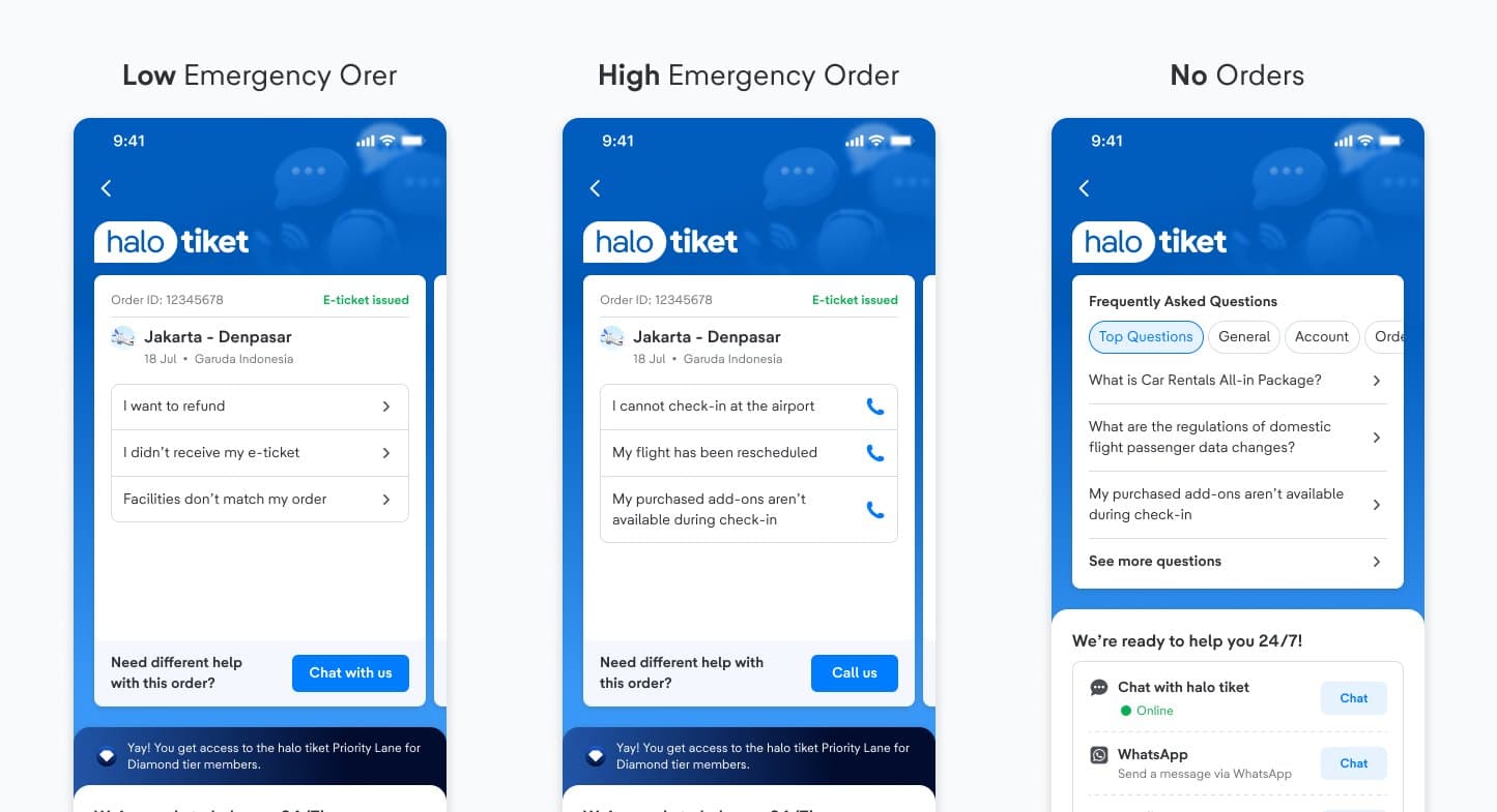
Each guiding goal maps directly to specific design decisions visible across the three contextual states: Low Emergency, High Emergency and No Orders.
Encourage Automation
Repeatable issues resolve before they reach an agent, non-urgent help moves into chat, and agents are freed for genuinely complex cases.
- Self-service content sits above every contact channel
- Quick Solutions (Request Reschedule, Request Refund) in the Low Emergency state
- Chatbot prompts for common issues, selected by order urgency
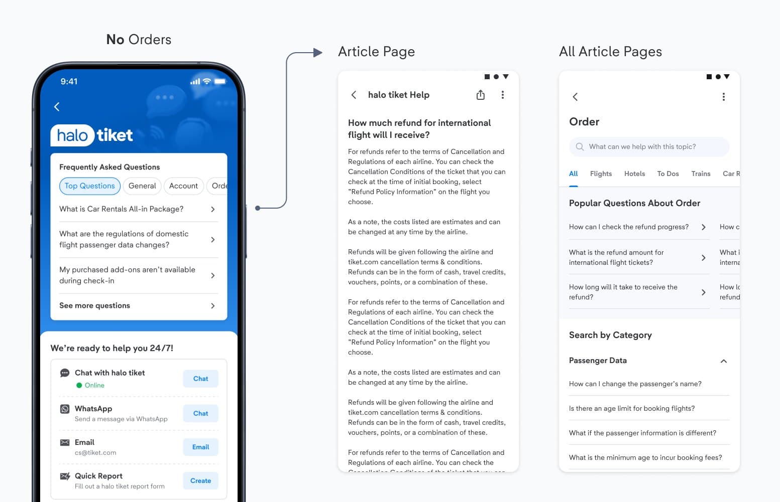
- FAQ-first layout in the No Orders state, with relevant articles before contact options
Contextual
By providing solutions based on user’s product journey, what a user sees changes with their order and how close their travel date is.
- Enable Call for High Emergency state: Within two hours of departure, Free Internet Call, Domestic Call and International Call appear. They are absent in every other state.
- Order card content shifts from general issues to time-critical ones: "I cannot check-in at the airport", "My flight has been rescheduled"
Simplicity
To minimize what users need to learn, we simplified the user experience to focus on what really matters to users.
- The order card shows only the three most relevant topics, replacing the old generic list
- No Orders state shows product-tabbed FAQs with relevant help topics
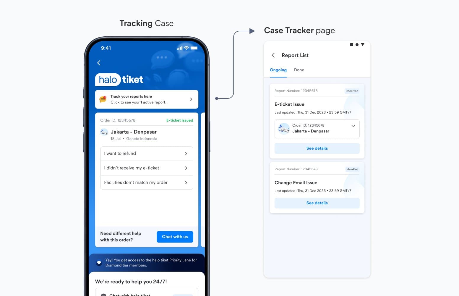
What if users already have an open case?
A dynamic entry point appears at the top of the page only when the user has an active complaint. It stays hidden entirely when there is nothing to track.
Success Metrics
Key Metrics & Business Value
Success is measured on whether users reach the right level of support at the right time, and on how much repeatable load the design removes from human agents.
📉 Contact-to-agent rate for repeatable issues
📈 Chat share of non-urgent support volume
💬 Agent capacity redirected to genuinely complex cases
Reflection
What I've Learnt & Special Thanks
Throughout this project, I collaborated with several new stakeholders as I just transitioned into joining Customer Service & Fulfilment Product & Design Team.
I led the redesign of the Help Center Revamp, facilitating workshops with stakeholders from CS, CX, Corporate Strategy, and others. Additionally, I conducted usability testing alongside the research team to optimize the user experience for tiket.com users.
I also contributed to the development of tiket.com's VOIP Call system and new chatbot, refining previous data and designs to deliver improved solutions that better meet user needs.
Collaborators
With thanks to everyone I worked alongside on this project.
- Product Design team - Yossie Gunawan, Nuriyah Amalia, Mawla Muhdiar, Sri Izzati
- Product team - Yocky Tegar, Rian Bastian
- Tech Platform Team
- CS (Customer Service), CX (Customer Experience), Brand Marketing, Corporate Strategy
Next project
Improving Train’s Booking Form Experience ↗