tiket.com / Car Rentals All-in Package Revamp
Revamping tiket.com’s Car Rentals All-in Package
This project showcases my expertise in three key domains:
- UX Research
- Data-Informed Design
- Product Strategy
- Project
- Car Rentals All-in Package Revamp
- Duration
- 2024
In A Nutshell
Revamping tiket.com’s Car Rentals All-in Package
This project covers the end-to-end redesign of the All-in Package for tiket.com’s Car Rentals with Driver. With only ~40% of bookings including the package, the goal was to communicate its value clearly and restructure it around how renters actually travel. I led the following efforts:
- User Interviews: Analysed Customer Service complaints to identify where package coverage caused confusion
- Behaviour Analysis: Used Amplitude to track where users engaged with, or overlooked, the All-in Package
- Ideation Workshops: Aligned Business Intelligence, Commercial, Product Managers and Tech Leads on the problem and a restructured package
- Usability Testing: Validated two concepts with Car Rental users, which moved the offer earlier in the booking journey
These efforts resulted in:
- +82.93% increase in All-in Package purchases, exceeding the original target of raising adoption from 40% to 50%
- +8.95% increase in GBV contribution margin per user
- +1.24% increase in search-to-book conversion rate
- Fewer booking disputes and customer service inquiries, as package coverage became clearer
Here’s how the story unfolds ▼
Context
Understanding Car Rentals
tiket.com is a Southeast Asian travel unicorn serving 52+ million active users, with 10+ travel products including Flights, Hotels and Trains.
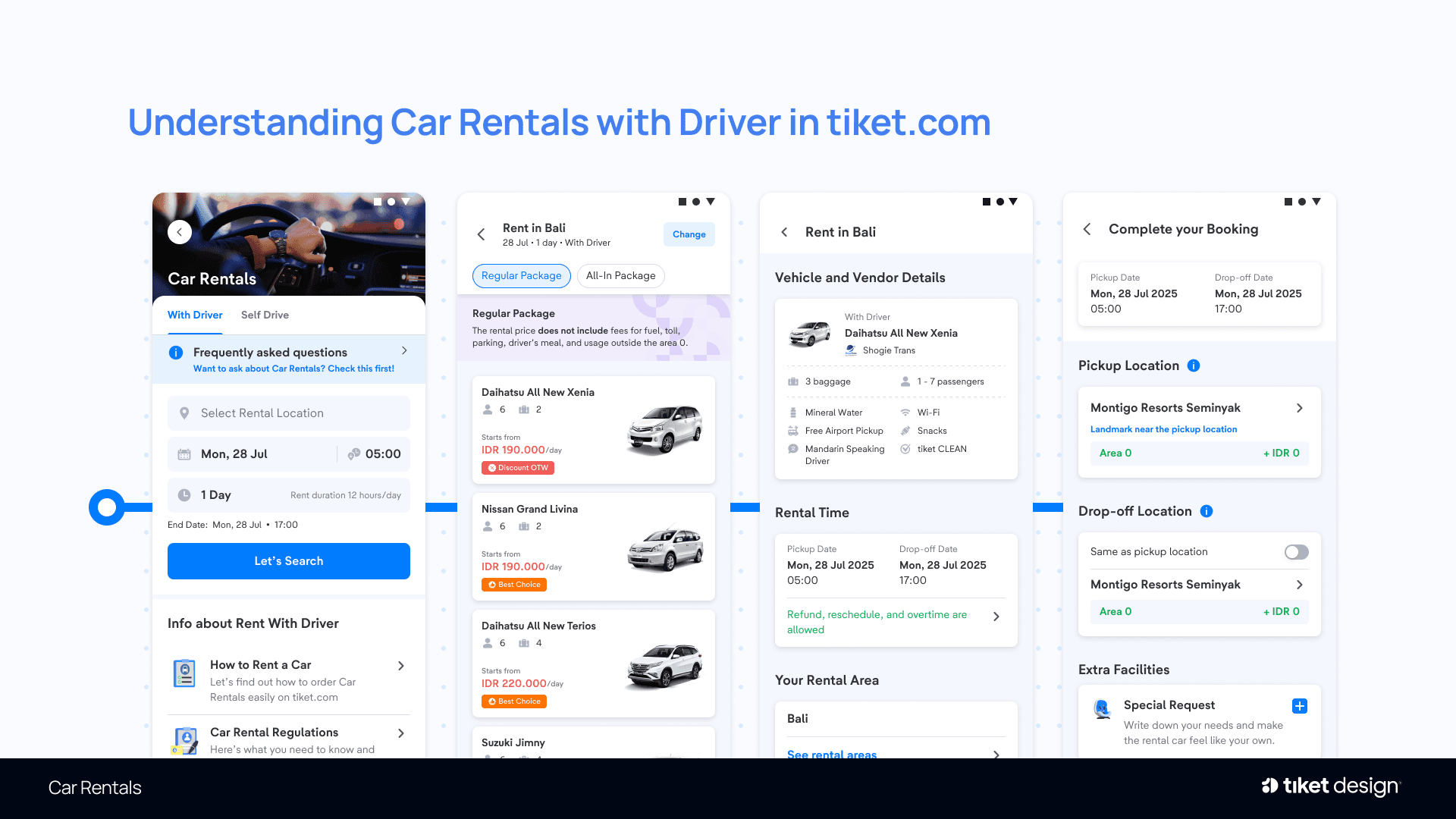
Car Rentals by tiket.com offers car rentals across Indonesia, with or without a driver. This project focuses on Car Rentals with Driver, whose main booking flow consists of:
- Landing Page: Users enter the rental city, date, time and duration.
- Search Result Page: Users select a car type, vendor and package: Regular (car and driver only) or All-in (which adds fuel, tolls and parking, the driver’s meals, and usage up to Area 2).
- Product Detail Page: Users review the selected car, vendor and package details.
- Booking Form: Users enter their pickup and drop-off locations, along with any additional Areas they plan to visit. Area 0 (the Main Zone) carries no extra charge, while Areas 1 to 3 are billed daily at increasing rates.
The Problem
Only ~40% of Bookings Included the All-in Package
The All-in Package was designed to protect renters from unexpected costs during their trip, yet only ~40% of bookings included it. Auditing each step of the booking journey revealed that users rarely noticed its value, and when they did, the package did not reflect how they actually travelled.
Two core problems were identified across four touchpoints:
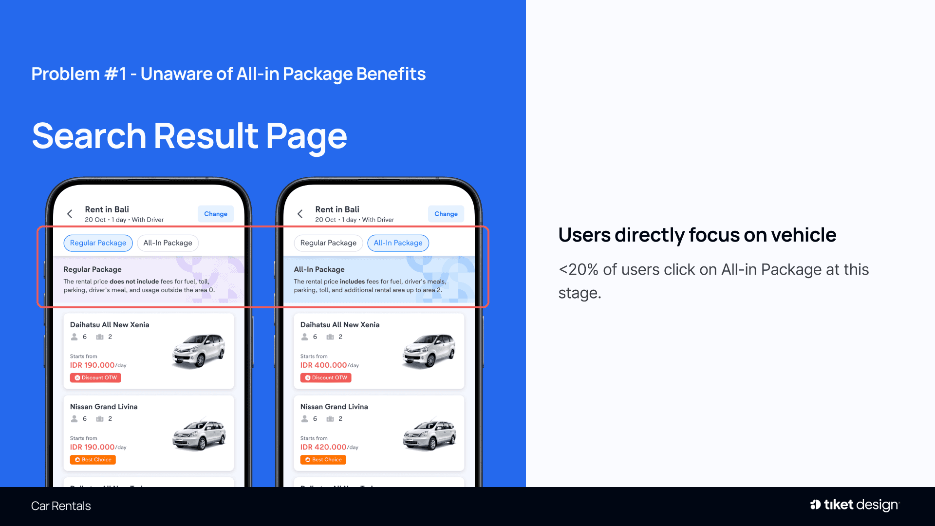
Problem #1: Unaware of All-in Package Benefits
Search Result Page: Users focus on the vehicle itself; fewer than 20% click on the All-in Package at this stage.
The package’s value goes unnoticed early in the journey
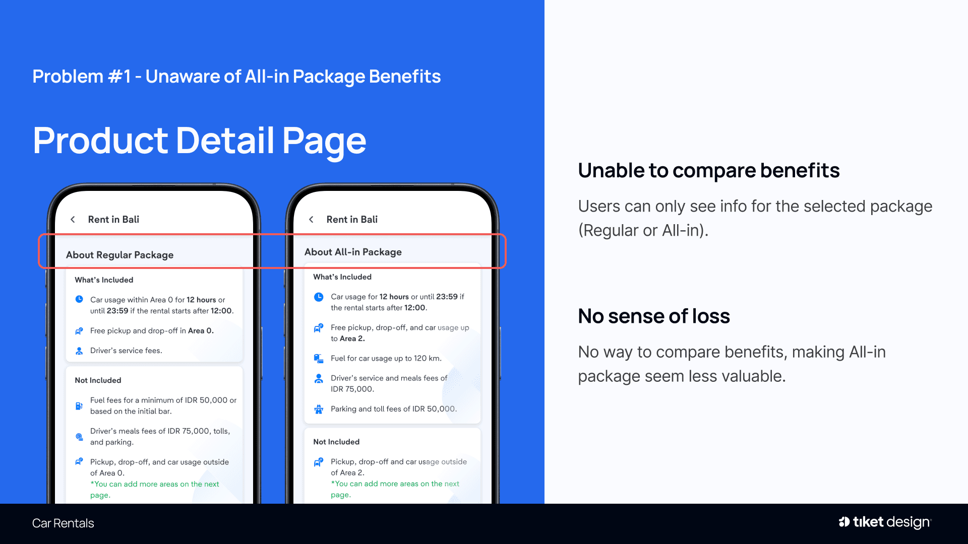
Product Detail Page: Users only see details for the selected package (Regular or All-in), with no way to compare benefits.
Without a comparison, skipping All-in carries no sense of loss
Booking Form Page: The All-in Package’s value is not highlighted, and fewer than ~5% of users select the option.
The final opportunity to communicate its value is missed

Problem #2: All-in Package Mismatch with User Needs
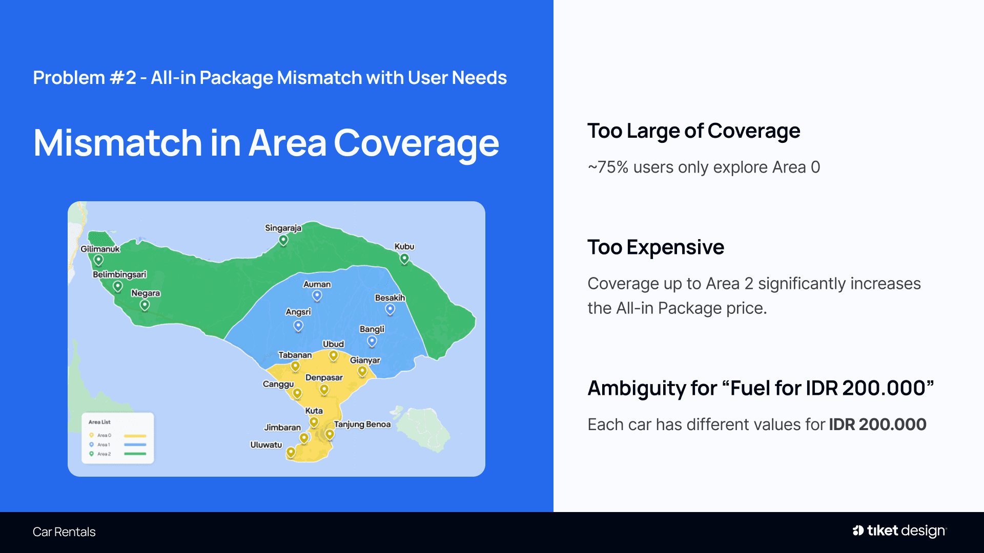
Mismatch in Area Coverage: ~75% of users stay within Area 0, yet coverage up to Area 2 significantly inflates the price, and “Fuel for IDR 200,000” translates to a different distance for each car.
The package feels oversized, overpriced and ambiguous
Defining Goals
What Each Stakeholder Needed from the Package
Users, the business and the product team each had a stake in the All-in Package. Before ideating, I documented each group’s needs so the redesign could serve all of them.
Car Rental Users
- Avoid unexpected costs during their trip
- Pay only for the coverage they actually use
Business Team & Vendor
- Increase All-in adoption by 25%, from 40% to 50% of bookings
- Grow revenue: All-in price × All-in adoption × total orders × All-in commission
Product & Tech
- Keep the booking flow simple, with a minimal learning curve
- Deliver within a manageable development effort
How Might We
Framing the Opportunity
HMW seamlessly communicate the benefits of the All-in Package?
HMW design a package that reflects users’ actual needs?
HMW balance profitability goals with a simple user experience?
Design Principles
Three Principles Guiding the Redesign
Value up front
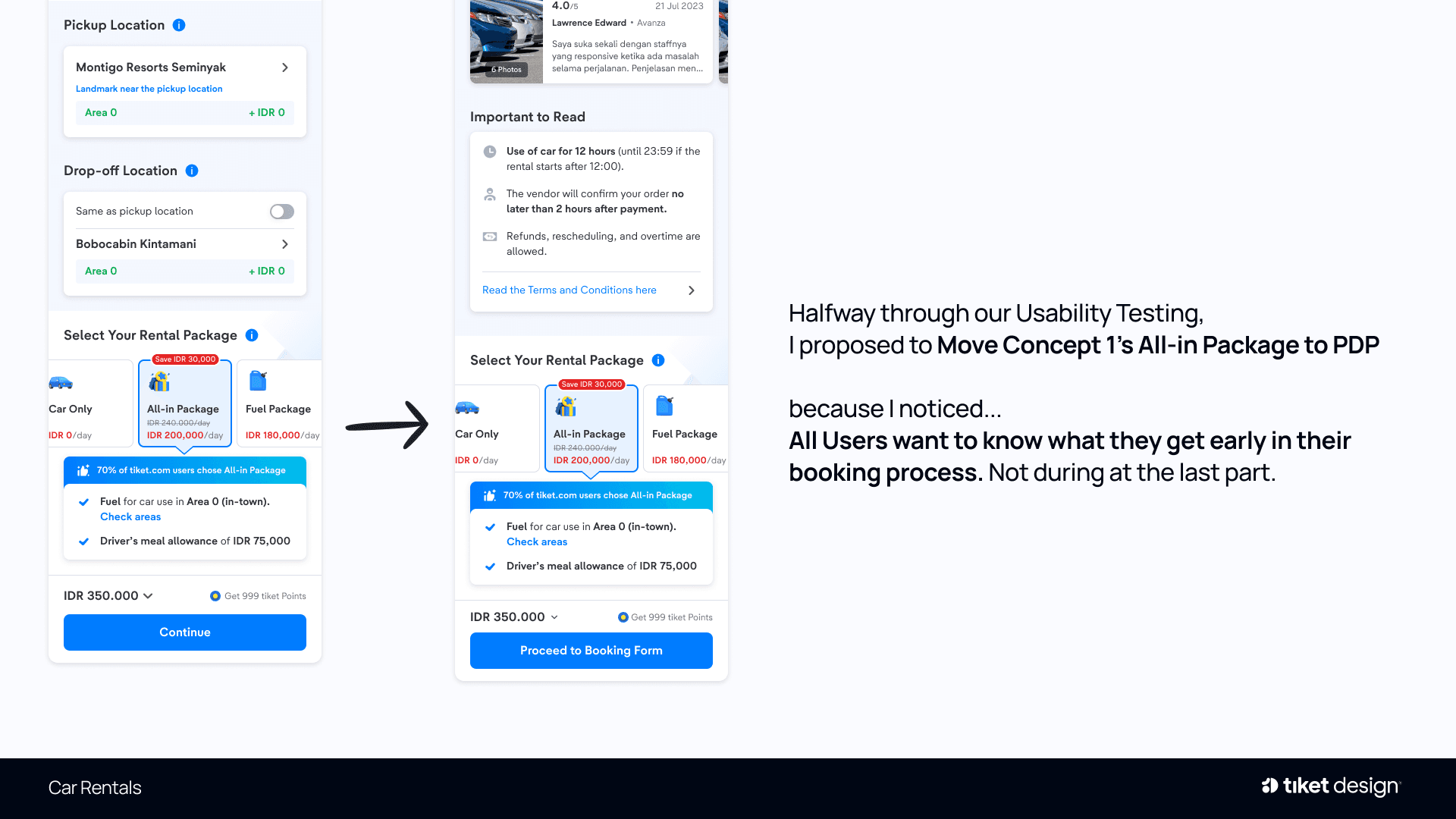
- Users want to know what they are getting early in the booking, not at the final step.
Make the loss visible
- Present packages side by side, so choosing not to take All-in feels like giving something up.
Right-sized coverage
- Build the package around Area 0, where most trips take place, rather than pricing every renter for the edge case.
Concept Exploration
Two Concepts from One North Star
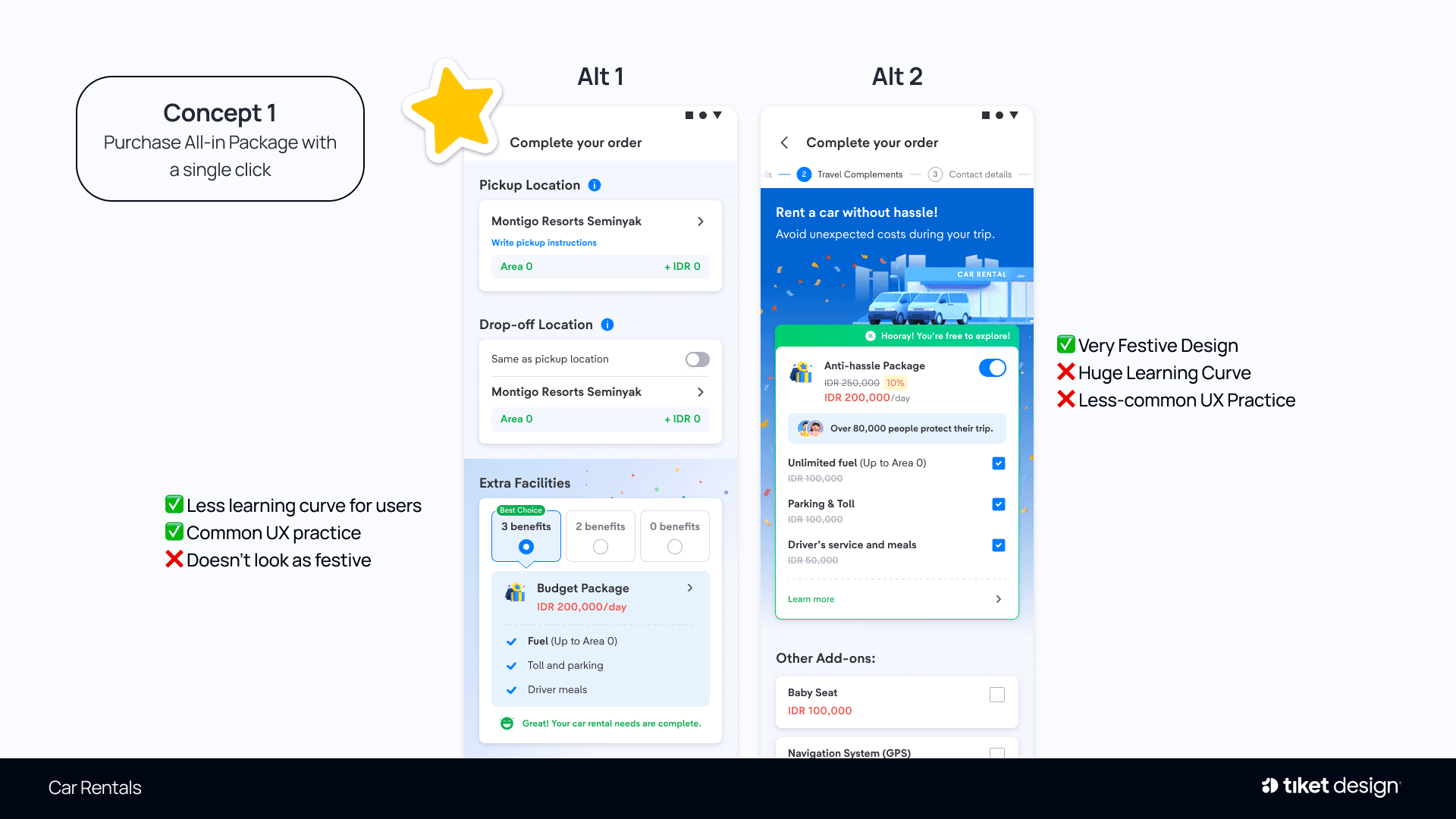
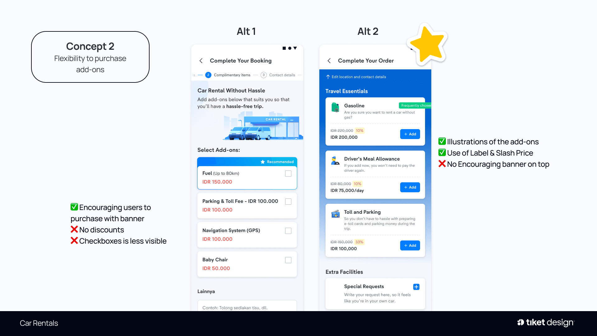
Using a WHO / WHAT / WOW framework, we defined a North Star: travellers who want to explore many places without worrying about additional costs. This led to two concepts: purchasing the All-in Package in a single click, and the flexibility to choose individual add-ons as needed.
Each concept was explored through two alternatives
Rebuilding the Product
Rebuilding the Package Itself, Not Just the Screen
Stakeholder Workshop
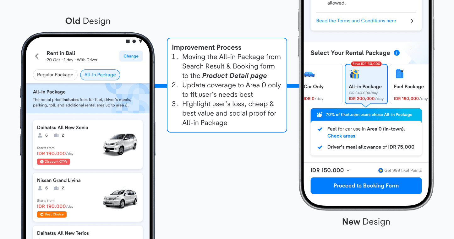
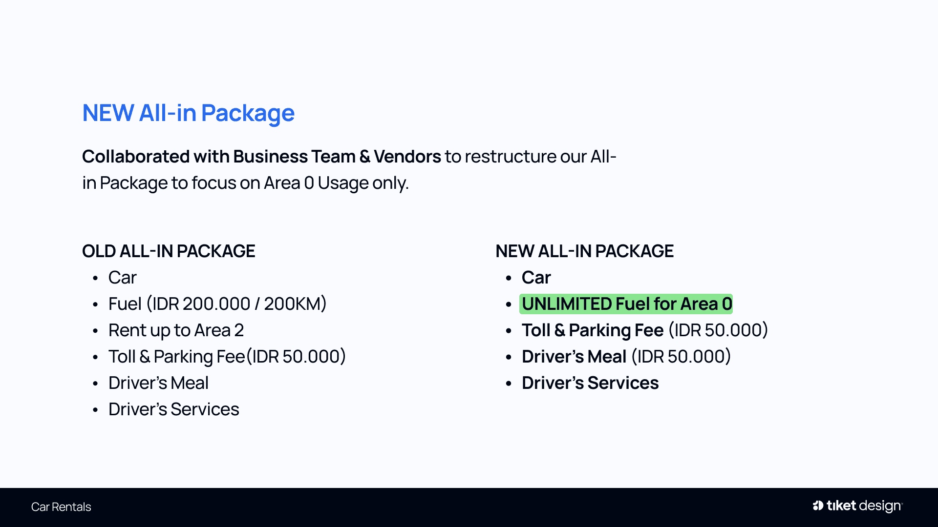
I facilitated a workshop with Business Intelligence, Commercial, Design, Product Managers and Tech Leads to align on the problem and review both concepts. The key challenge was balancing profitability goals with simplicity for users. Two findings reshaped the package: capping fuel at a fixed amount (120km or IDR 200,000) was not meaningful to users, and Area 0 to 2 coverage added unnecessary complexity. Together with the Business team and vendors, we restructured the All-in Package around Area 0 with unlimited fuel.
Usability Testing
We tested both concepts with Car Rental users, and the findings reshaped where the offer should appear.
KEY INSIGHT
- Midway through testing, I proposed moving Concept 1’s All-in Package to the product detail page, as every participant wanted to know what they were getting early in the booking, not at the final step.
CONCEPT 1 · PACKAGES ON THE PRODUCT PAGE
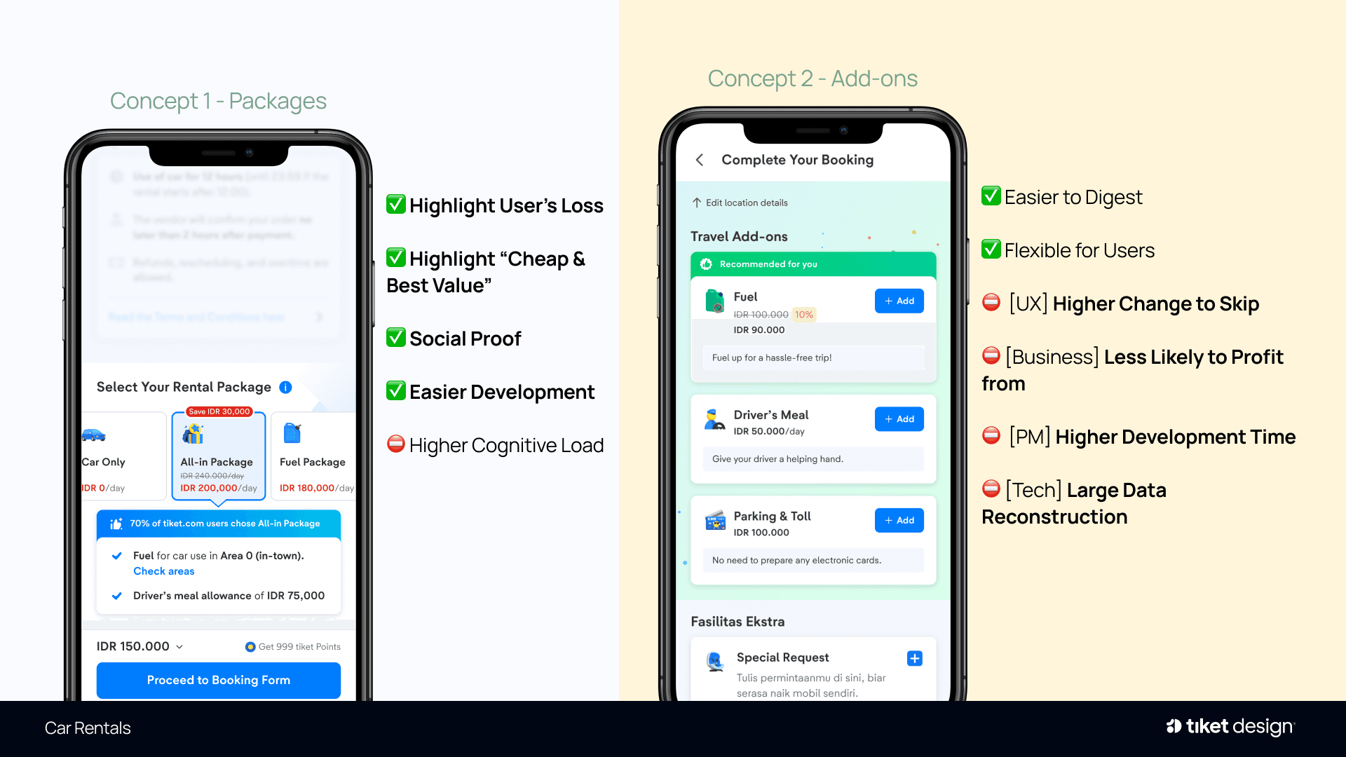
Car Only, All-in and Fuel packages presented side by side while users are still reviewing the car.
CONCEPT 1 VS CONCEPT 2
Packages were easier to build and communicated value clearly; add-ons offered flexibility but were easier to skip, less profitable and slower to build.
Final Design Proposal
One Package Choice, Right Where Users Decide
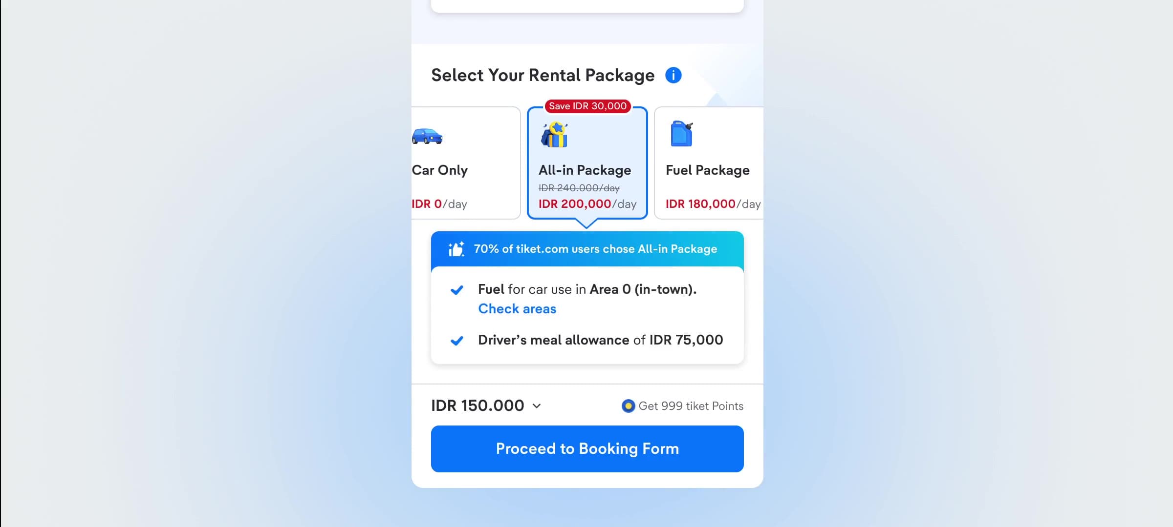
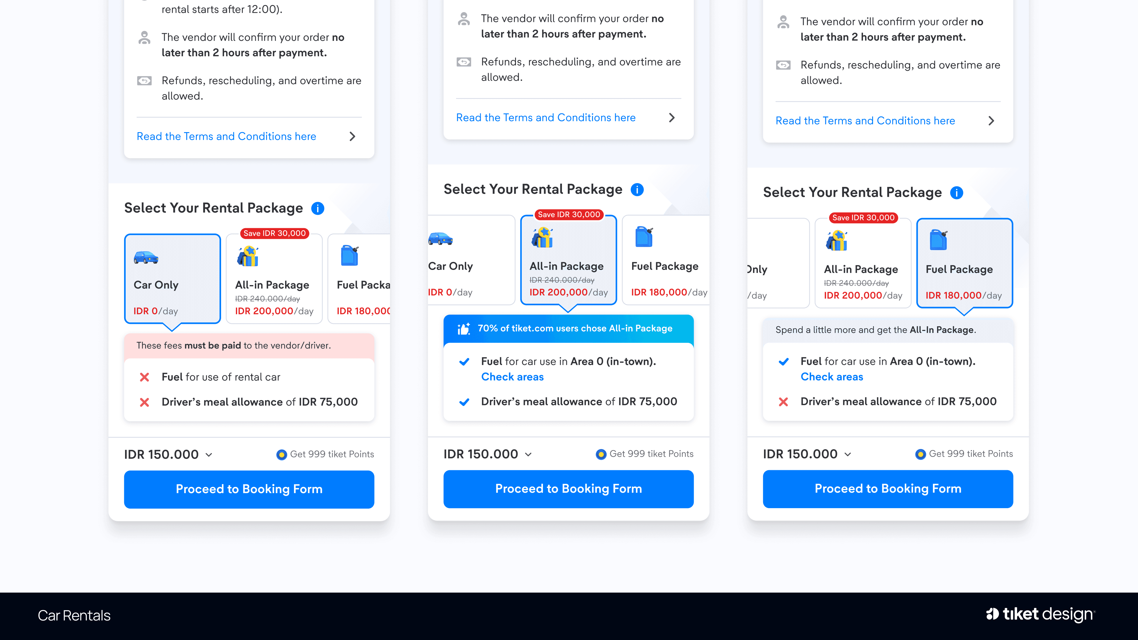
Following testing, Concept 1 was selected: the All-in Package now sits on the product detail page, restructured around Area 0 with unlimited fuel. The proposal rests on a single hypothesis: once users can clearly see what the All-in Package offers, more of them will choose it. To reinforce this, the page presents three packages, with the Fuel Package acting as a decoy that positions All-in as the best value.
Why It Will Increase All-in Package Take-up
The new design will increase the All-in Package take-up rate because users can now see the benefits of the All-in Package. Car Only, All-in and a Fuel Package decoy presented side by side on the product detail page, with All-in highlighted by default.
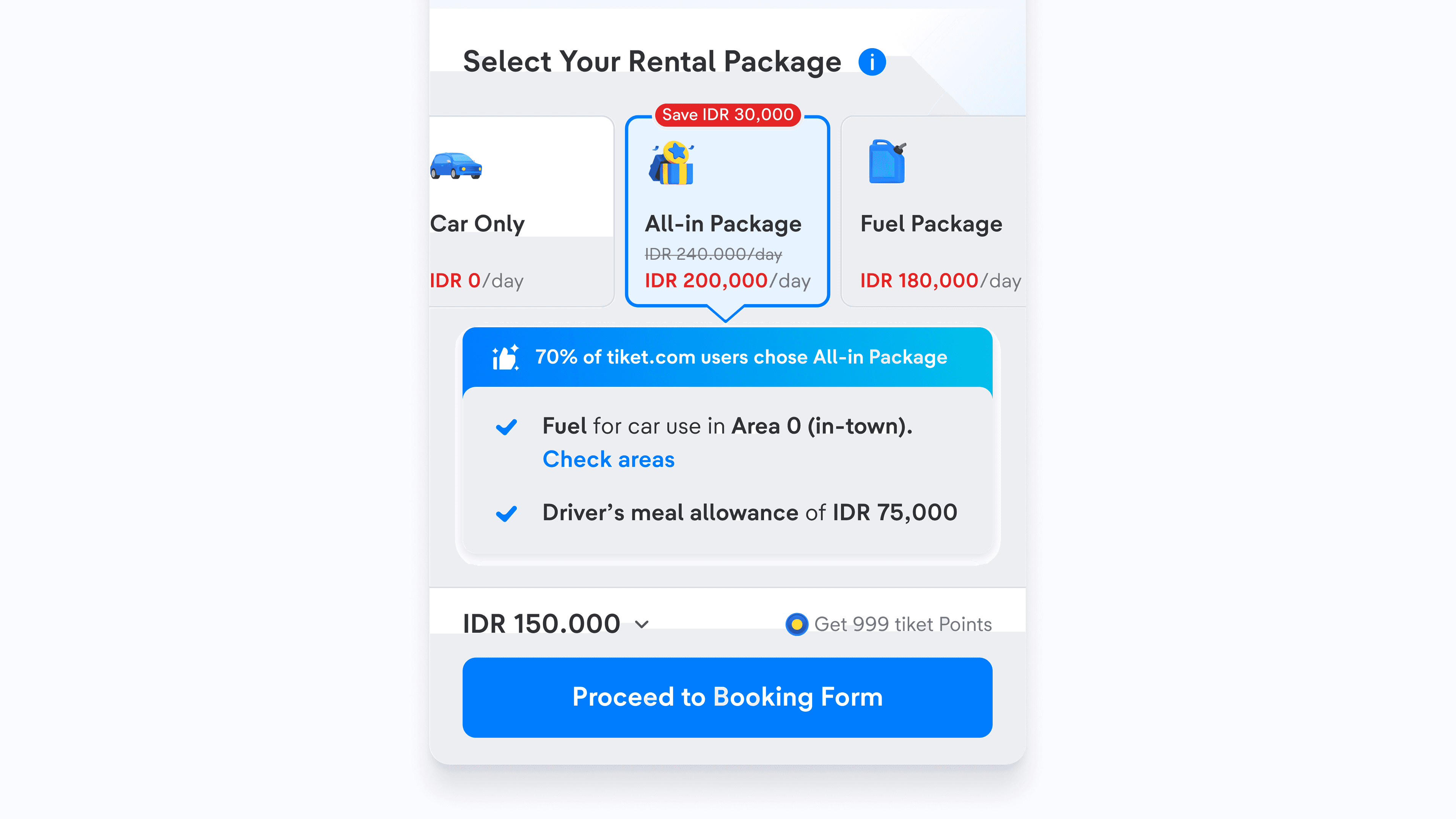
- Highlight the user’s loss: Car Only is shown first, with its exclusions clearly marked, so skipping All-in feels like giving something up.
- Highlight “cheap & best value”: A savings badge and slashed price position All-in as the best deal rather than an additional cost.
- Social proof: “70% of tiket.com users chose All-in Package” signals that other renters trust it.
- Right-sized coverage: Unlimited fuel within Area 0, where ~75% of users travel, makes the benefit tangible and the price fair.
The Success Story
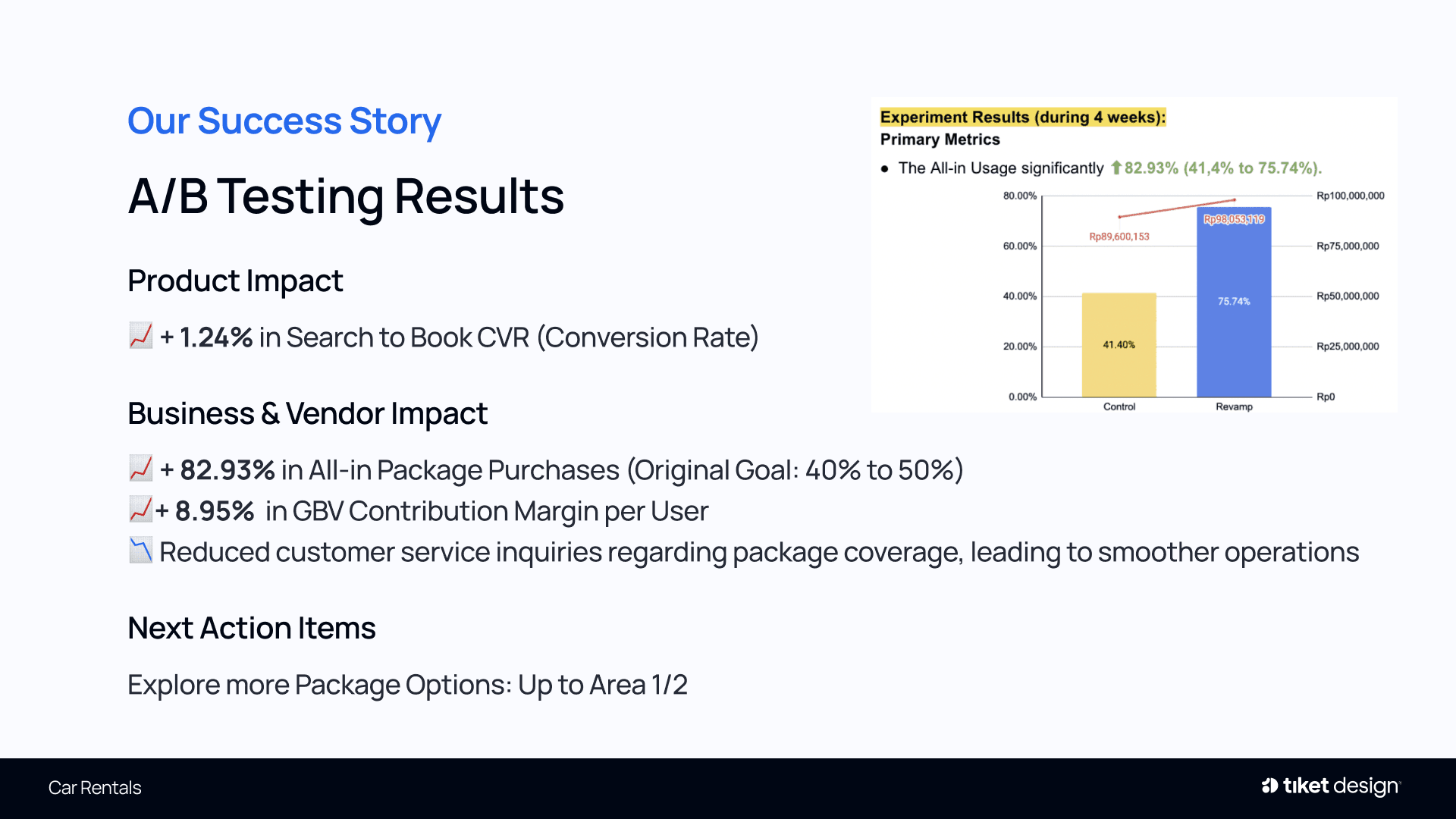
A four-week A/B test compared the revamped All-in Package against the original flow.
ALL-IN USAGE
All-in adoption rose from 41.4% to 75.74%, a +82.93% increase that far exceeded the original target of 50%.
BUSINESS & PRODUCT IMPACT
+8.95% in GBV contribution margin per user, +1.24% in search-to-book conversion rate, and fewer customer service inquiries about package coverage.
NEXT STEPS
Explore additional package options covering Areas 1 and 2 for renters travelling beyond the Main Zone.
Reflection
What I've Learnt & Special Thanks
During this project, I learnt that:
- A long project can be deeply rewarding when the impact is this clear
- Working with multiple stakeholders requires being proactive, understanding their needs and filtering feedback
- Fresh perspectives matter: feedback from our VP of Design and the UX Writing team revealed blind spots
Beyond the interface, I also:
- Restructured the All-in Package itself, together with the Business team and vendors
- Presented the results to stakeholders across Product, Commercial, Design and Tech
Special thanks to my main collaborators
Thank you to everyone I worked with on this project
- Non-Flight Transportation team, including Product Designers, UX Writers, UX Researchers and Illustrators
- Product Managers, Business Intelligence and the Commercial team
- Tech Leads and our Car Rental vendors
Next project
Improving Train’s Booking Form Experience ↗